The thinking behind our latest brand campaign
Por Katie Chang
Head of Creative Strategy & Operations, Notion
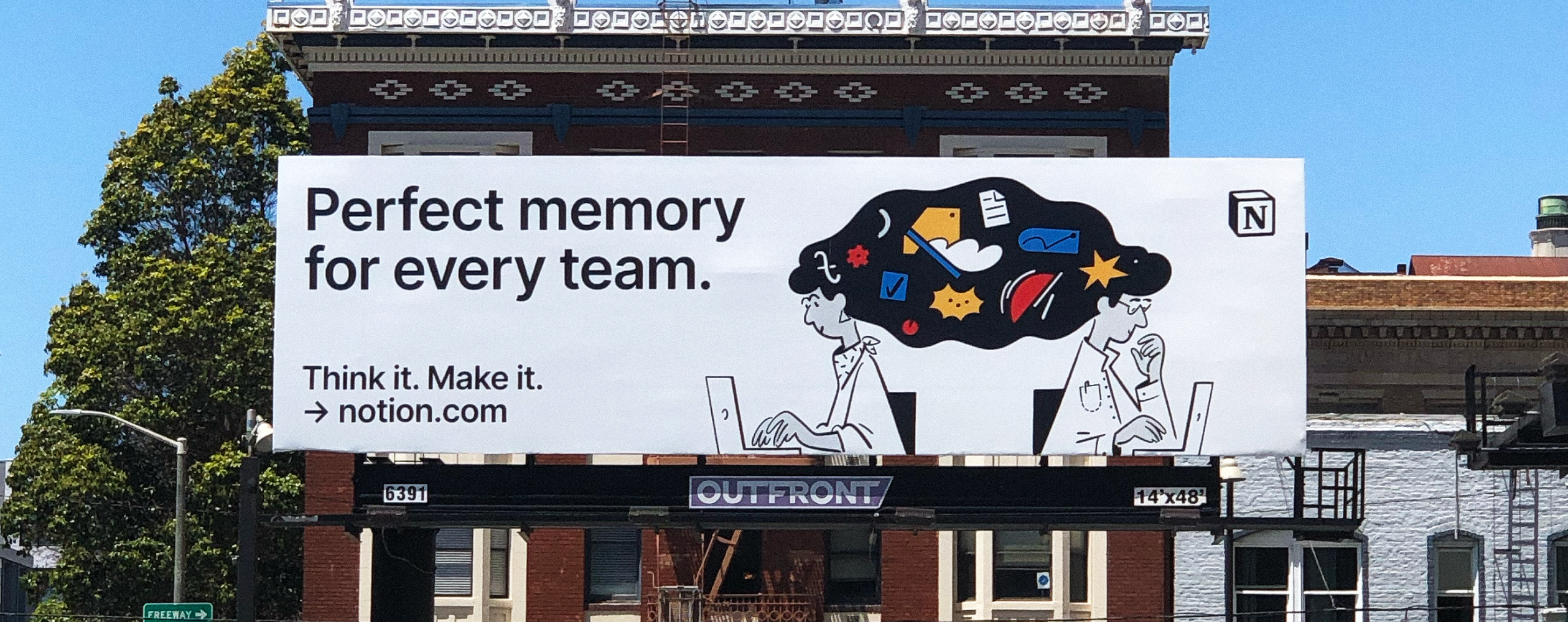
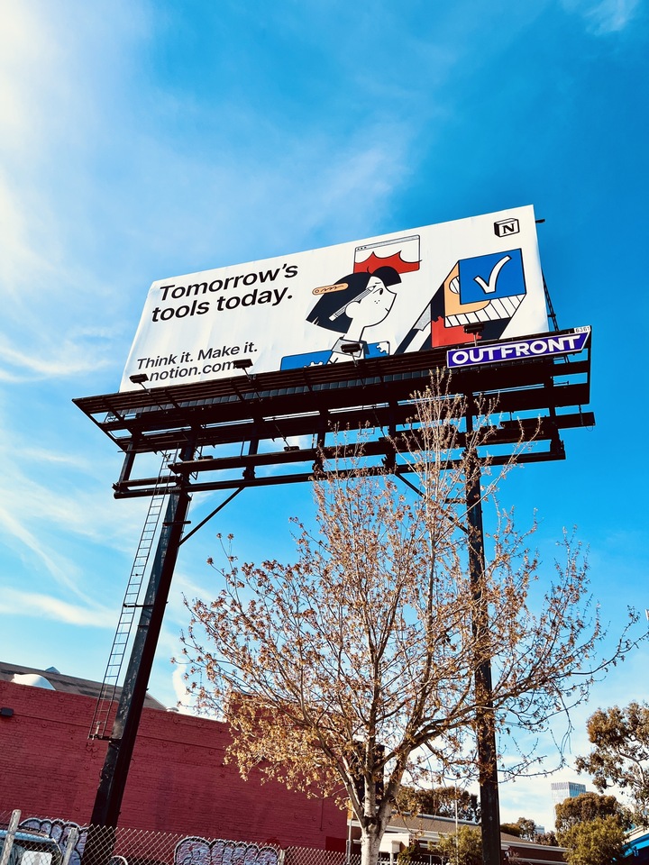
Maybe you’ve seen it on a billboard in San Francisco, or in a tube station in London, or at a bus stop in Seoul. Notion’s latest Think it. Make it. campaign took eight months to create, involved thousands of sketches and taglines, and has appeared in 11 cities around the world.
The campaign is deceptively simple—pairing bold headlines with our long-time illustrator Roman Muradov’s distinctive drawings. But it’s more than just a smattering of posters and billboards in a handful of cities. It’s the culmination of years of building, creating, reimagining, and growing. It’s a reflection of Notion itself.
We wanted to share a deeper look at the process: How we landed on Think it. Make it. as a tagline, and how this kernel of an idea developed into a full-blown campaign.
Finding the words to tell our story
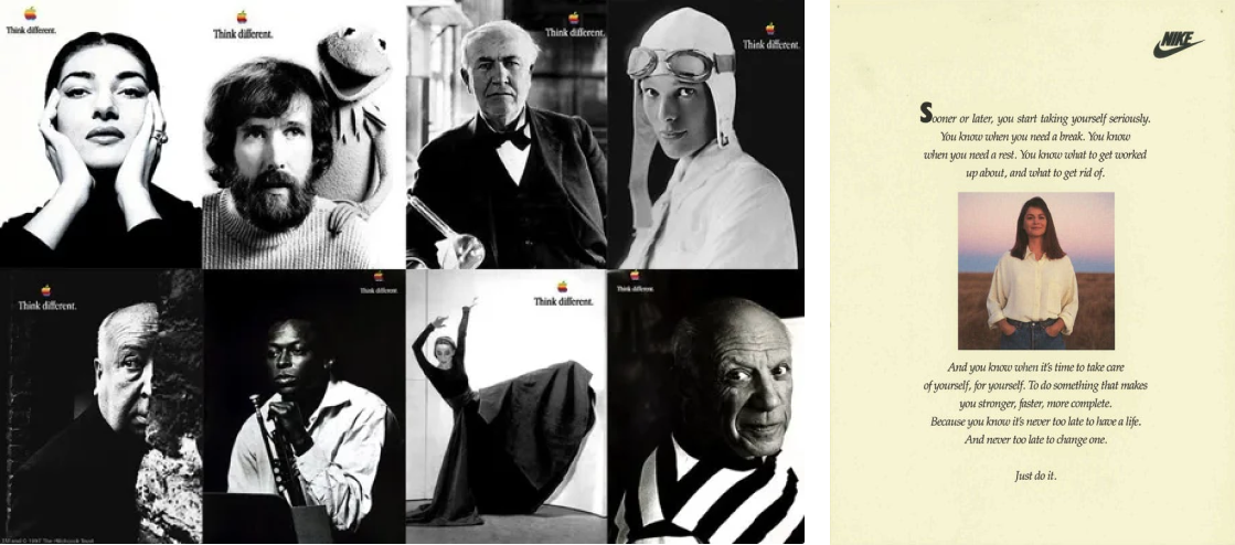
Memorable taglines go beyond words on a page. They tap into our deepest aspirations through association: if you use this product, you will achieve greatness. Apple’s “Think different.” speaks to the innovator, ready to “make a dent in the universe,” as Steve Jobs famously said. Nike’s “Just do it.” isn’t about shoes or even athletics—it’s a call to push through perceived limits to reach new heights.

Our aim was to create a campaign that would expand people’s understanding of Notion beyond productivity software. It had to suggest how the tool allows people to organize their knowledge both in work and in life. We often describe Notion as a set of building blocks—like LEGO—that allow users infinite variations. But distilling those variations down to just three or four words in a tagline was no small feat.
We knew from the start that this campaign wouldn’t come together overnight. So with help from design agency, BUCK, we iterated for months on thousands of taglines to find something that felt just right, something unequivocally Notion.
Turning ideas into visuals
As we worked on the tagline, we began thinking through what this campaign would look like in the wild. From its earliest days, Notion’s brand has been illustration-driven, with smart and imaginative storytelling. Our hope was to push the boundaries even further.
We started with a few foundational principles that we wanted to follow.


Be distinct. Our original brand illustrations were created by Roman Muradov back when Notion had just a few employees. Even at that early stage, the intention was to stand out.
“The minimalist illustrations with gestural lifework stood out among the vector illustrations that most companies were beginning to use,” says Roman. “People started telling me they got into Notion primarily because they loved the illustrations.”
Show, don't tell. We wanted to underscore how Notion can help you develop your ideas and get more done in your life and work, individually and collectively. Add in AI, and your second brain develops a kind of perfect memory that can tap into all of your stored knowledge. But how do you visually represent such an abstract concept? We wanted to blend intelligence and AI into our designs in a new way.

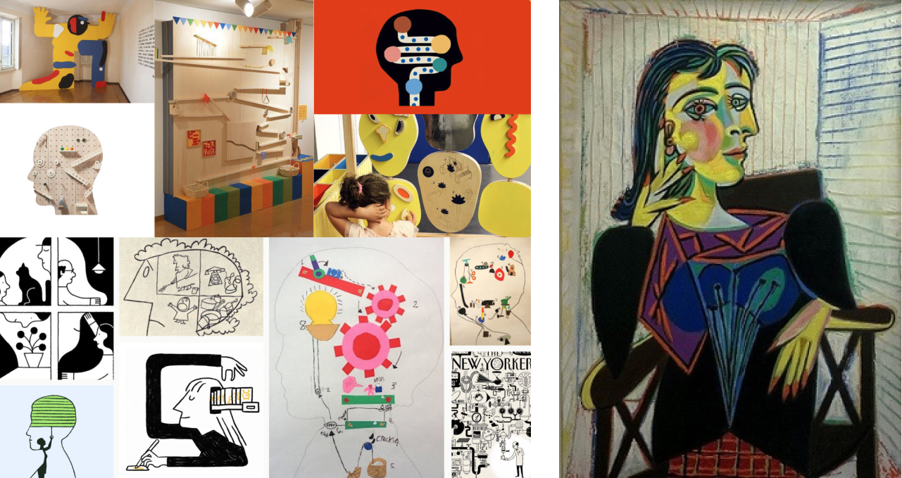
As a brand that cares deeply about craft, we drew inspiration from artists like Picasso, Rube Goldberg, and Saul Steinberg to bring these themes to life. The Goldberg-influenced contraptions represent knowledge work, and cubism helped us convey layers of complexity. We pictured the figures from the side, the traditional pose of the thinker, so viewers could see their brains at work.

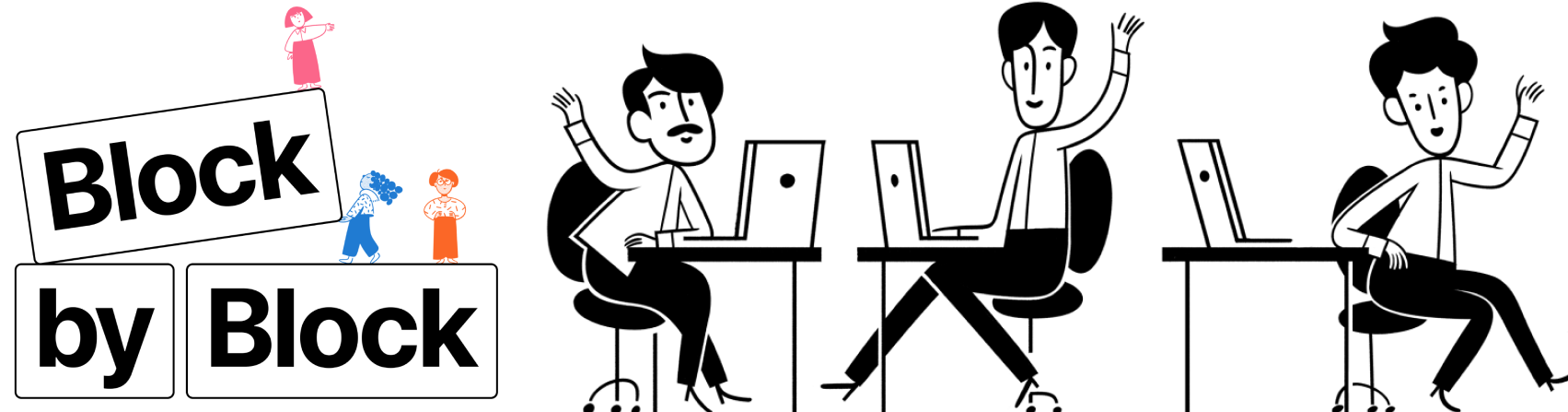
Move in closer. As our concepts evolved, we explored new vantage points for the illustrated characters. Roman’s early Notion drawings showed our characters at a distance, their full bodies working and playing in various environments. But seeing them from so far away could at times feel a bit impersonal. This begged the question: can we move a little closer to these characters to truly understand who they are?
Rob Giampietro, Notion’s Head of Creative, explains why that was important.
“Moving closer is a natural part of storytelling. It's how we show engagement and curiosity,” he says. “We lean in to see things more vividly in a film; from an establishing shot to a close-up, we engage with characters on a deeper level. As we focus more intently, new possibilities emerge.”

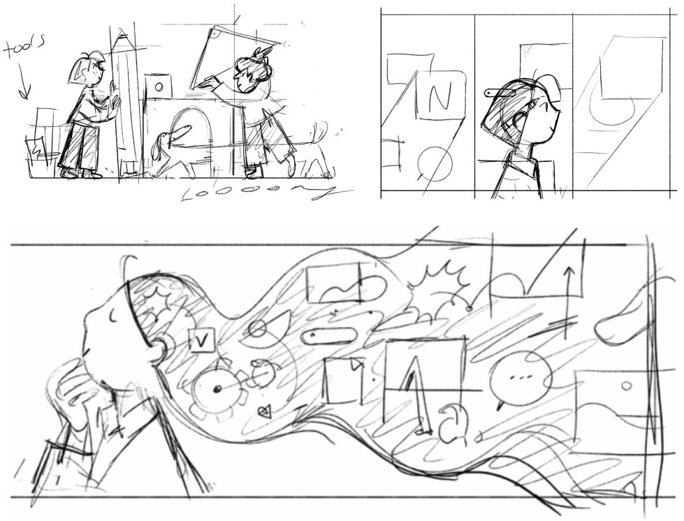
This approach allowed us to peek inside our characters’ thought processes and how they bring ideas to life. The visual story we wanted to tell was that, if you used your imagination to think up an idea, you could make virtually anything happen.
There it was. The “aha” moment. We had our new tagline: Think it. Make it.
Setting Think it. Make it. free in the wild
Once we’d landed the tagline and nailed down our illustration direction, we turned to the campaign’s deliverables. How were we going to take these new creative concepts from drawing board to billboard?

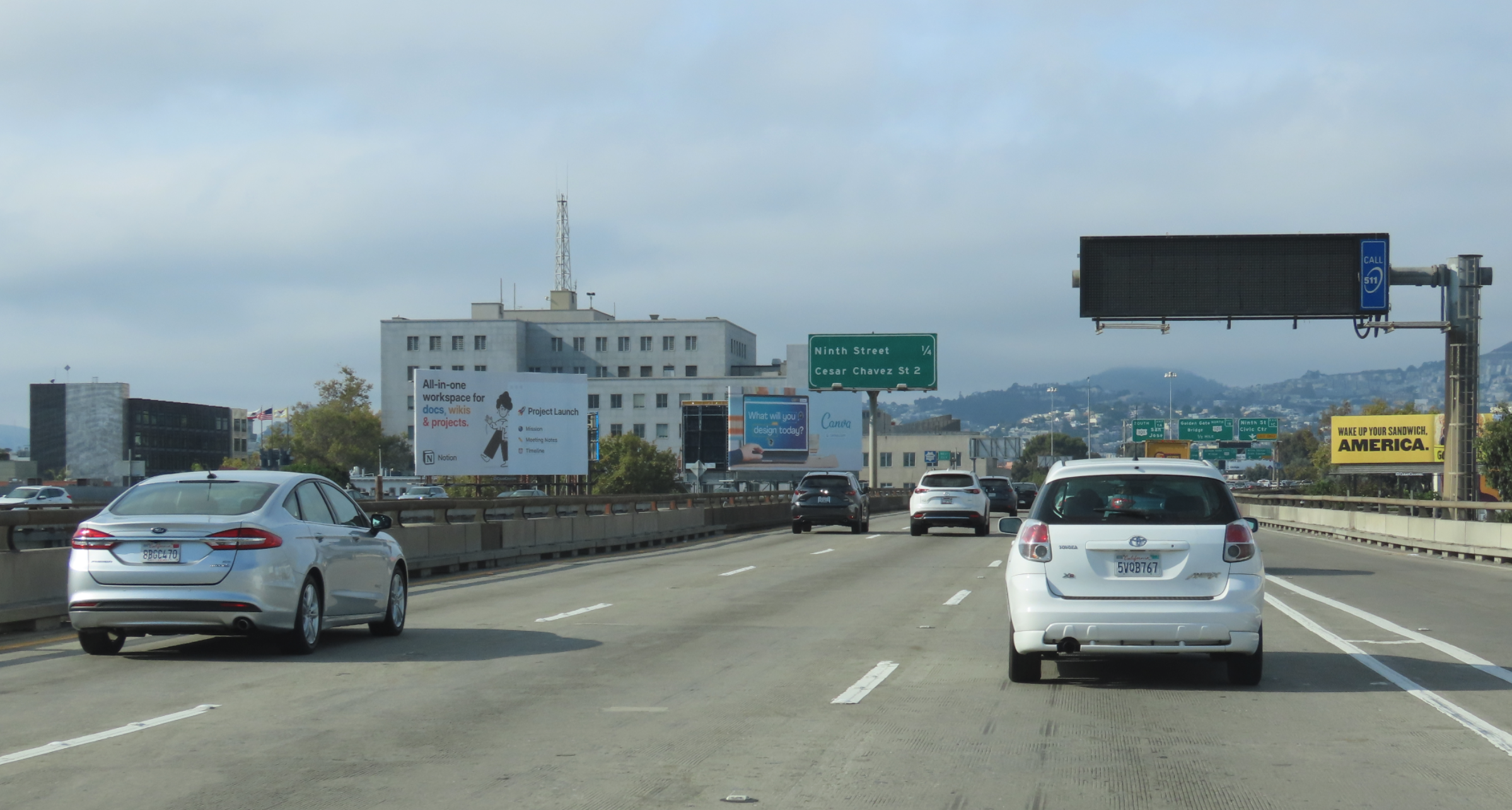
Our original branding and illustrations were all created in black and white. But cities are busy, and without color, it’s hard to stand out. Can you see the Notion ad in the image above? (If you missed it, we understand.)
While we refrain from using bright colors in the Notion app, our ads have a different set of constraints. They’re there to delight, interest, and excite, so we incorporated more primary colors—yellows, blues, and reds—into our palette.

Our Think it. Make it. campaign is more than a tagline. It encourages people to turn ideas in to action. A brand is a living thing, and ours continues to evolve from those early illustrations. Now with AI, it’s become more powerful and vivid than ever before, reflecting new opportunities for creativity.
We’re excited to see how you continue to think and make in ways we’ve yet to imagine.

