http://www.jankoatwarpspeed.com/ultimate-guide-to-table-ui-patterns/
Many agree that tables are a phenomenon in user interface design: they are very important parts of user interfaces but often overlooked. Tables show structured data and their purpose is to make that data readable, scannable and easily comparable. The thing is that in many cases tabular data is obscured. This is why tables have bad reputation and many find them boring.
The truth is that the are everything but boring. For people who need tables in everyday work they are hated element that makes them scream. And it shouldn’t be this way. Here are some of the patterns that can help in creating less evil tables.
Ok, this one is pretty obvious. But is it? Take a look at the web applications (and websites) today and you will see that many don’t apply it. So it is not obvious and that’s why it’s first in the list here.
By styling alternating rows differently you increase the ability of users to distinguish between overcrowded data in multiple rows and columns. You can use background color or background image. If background color is used it should be just slightly lighter/darker than a page background. For background images you should choose subtle gradients that match your color scheme. You can also combine background colors/images with table borders. Table header and footer should be easily recognizable and to achieve that you can use darker (or lighter) colors than table row colors.
BlinkCampaign uses subtle green color for alternate rows while keeping the header a bit darker.
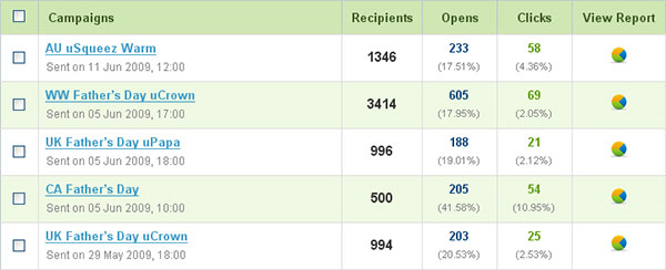
If there is a single action that can be performed on a specific row, you can make the entire row clickable. This expands clickable area and declutters an interface. This can be used if, for instance, the only action you can perform on each row is view details. Each row should have hover state styled differently. There are several ways to achieve this effect, among which I would recommend you RowSelect jQuery plugin.

CrazyEgg uses full row selection to expand the details of the current selection (we’ll talk about this pattern a bit later). Row which is being hovered is slightly lighter. I really like how they designed this area (as well as the rest of the application).
When you need to group related rows you can consider using table sections (or table grouping). A section is a part of the table that groups related data. All groups shares same set of columns. For example, in a table that shows list of countries, regions are natural way to group rows. Each section should be styled differently and can be collapsible/expandable. Under each section you can show summarized data, if needed.
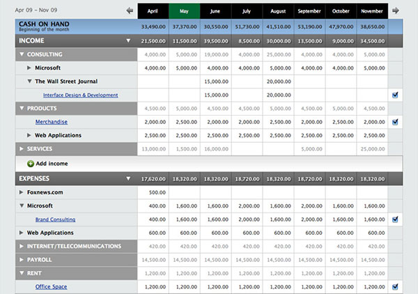
PulseApp uses table sections to show income and expenses details, but also to group data in subsections that will show even more details. Each section and subsection is expandable.
Sorting is used for cases when users have difficulties in finding a row they want in a very large set of data but they don’t know any keyword that can be searched by. Users also sort tables by columns when they want to compare adjacent information.
The common practice for enabling sorting on tables is to make header labels clickable. A column by which the table is sorted should be marked. This is usually done by placing an arrow next to column name, indicating in which order the column is sorted (ascending or descending). Clicking on a column that is already sorted should just reverse the order.